Brands we've built to lead their field
Four real engagements across three countries, two languages, and four industries — luxury real estate, agriculture, plant nutrition, and live culture. Every one built from the brand up, not from a template.
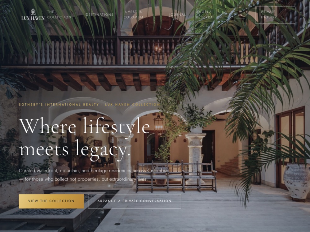
Lux Haven Collection
A boutique advisory presenting Colombian estates to an international, ultra-high-net-worth audience needed a digital home as considered and discreet as the properties themselves. Off-the-shelf real-estate templates read like every other listing portal — the last thing a private-client brand can afford.
We built a bespoke, data-driven site from the ground up — no page builder, no stock theme. An editorial design system (Cormorant Garamond and Jost, a deep midnight-navy and gold palette) sits over a listings data layer, so new estates and their dedicated landing pages ship quickly without ever disturbing the design. Discretion was engineered in, not bolted on: sensitive parcel, ownership and pricing detail can be withheld per property.
- Fully bilingual EN/ES site with a data-driven listings architecture and individual property landing pages
- Buyer-facing tools — a curated collection browser, side-by-side compare, and investment/compass views
- Per-listing discretion controls that keep confidential detail out of anything shipped to the browser
- Refined navy-and-gold brand system with the real logo and editorial typography throughout
It reads like a private client presentation, not a property portal. For UHNW real estate, restraint is the luxury — the design gets out of the way so the estates and the advisor's judgment carry the room.
Read the case study →Visit the live site ↗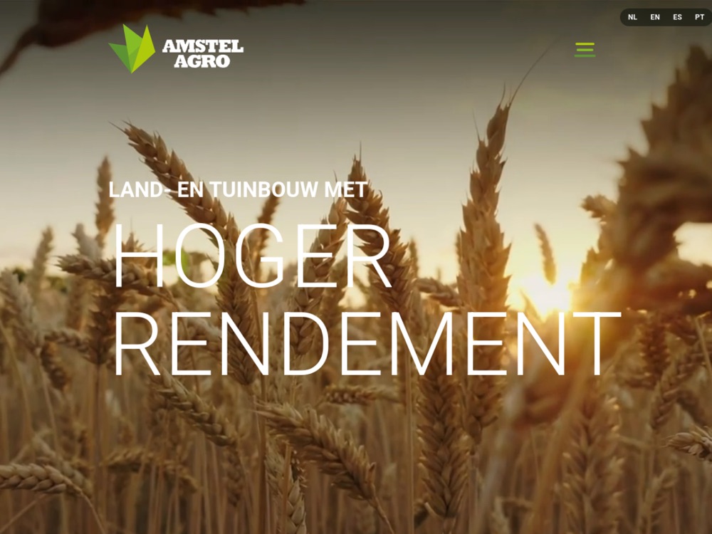
Amstel Agro
A Dutch biomineral, silicon-based fertilizer brand moving into Spanish-speaking agricultural markets needed a site that spoke to serious growers in their own language and looked as advanced as the science behind the product. Most agri-input sites are industrial, dated, and talk down to the farmer.
We built a Spanish-first, photography-led site with a dark editorial treatment — written for the market, not translated into it. It mirrors the premium feel of the wider Mills family while carving out Amstel's own identity, using Fraunces and Inter, the brand greens, and imagery rooted in soil and crop rather than lab and logo.
- Spanish-language marketing site with a premium, photography-led design system
- Clear product and benefit sections that frame the silicon science as an advantage, not a spec sheet
- Distributor and contact pathways with a request-information call to action
- Fast, dependency-light static build, deployed live on its own hosting
It treats farmers as the sophisticated buyers they are. Agricultural credibility meets luxury restraint — the result feels closer to a premium consumer brand than to a fertilizer catalog, which is exactly the distance that wins trust.
Read the case study →Visit the live site ↗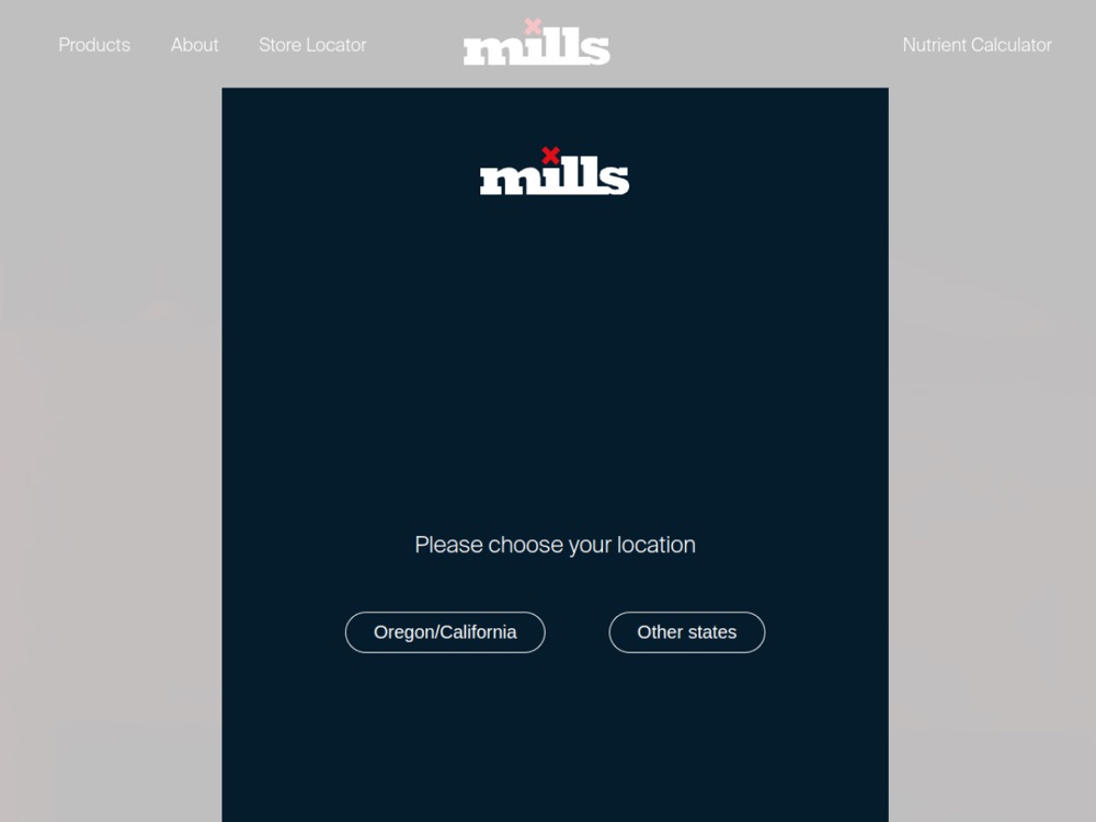
Mills Nutrients
An international plant-nutrition brand selling across Europe needed its online store to sell as fluently in French and Italian as it did in English — every product, price, cart label and checkout step, not just the marketing pages. Half-translated storefronts quietly lose the sale at the exact moment it matters.
We localized the full store on its existing WordPress, WPML and WooCommerce stack. Brand-voice surfaces were hand-translated; the catalog ran through context-aware translation; then we chased the edge cases that template systems always leave behind — the cart plugin's own separate label system, missing imagery on translated products, hardcoded category links, and size/volume variation labels that fell back to English.
- French and Italian added end-to-end — menus, catalog, product pages, cart, checkout, and cookie banner
- Fixed the cart-label, product-image and category-link gaps the translation layer missed across multiple templates
- Variation attribute labels (size, color, volume) correctly localized per language, including bottle volumes vs. garment sizes
- Verified live in every language, with English confirmed unchanged
Real localization lives in the details a translator never sees — the cart button, the size label, the link that quietly points back to the English page. Getting those right is the difference between a store that's been translated and one that simply feels native.
Read the case study →Visit the live site ↗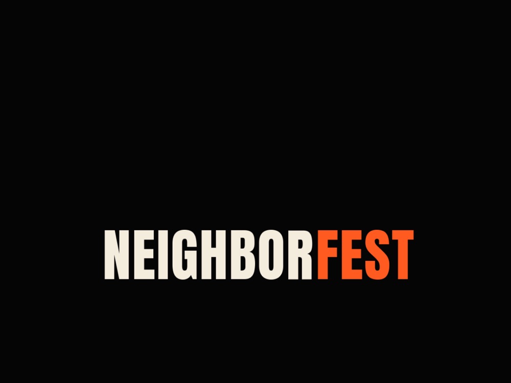
Neighbor Fest
A one-day NYC community festival needed a site with the energy of a block party and the polish of a real brand — a single page that tells the story, captures its Caribbean-Brooklyn spirit, and sells tickets without ever looking like a generic event template.
We built a bold, dark editorial one-pager around the organizer's own festival watercolor as the centerpiece — big display type, mural-bright accents, a live countdown, and animated sections. Ticketing was embedded first-party on a custom domain so buyers complete checkout on the site itself rather than being bounced to a third-party page.
- Responsive single-page festival site with live countdown, animated sections, and real event photography
- Embedded Ticket Tailor checkout served from the festival's own domain, keeping the purchase on-site
- SEO, Open Graph, and Schema.org Festival markup for search and social sharing
- Launched live on its own domain, verified across desktop and mobile
It feels like the festival before you've even arrived. The energy sells the day and the ticket path is frictionless precisely because it never leaves home — the moment of intent and the moment of purchase happen in the same place.
Read the case study →Visit the live site ↗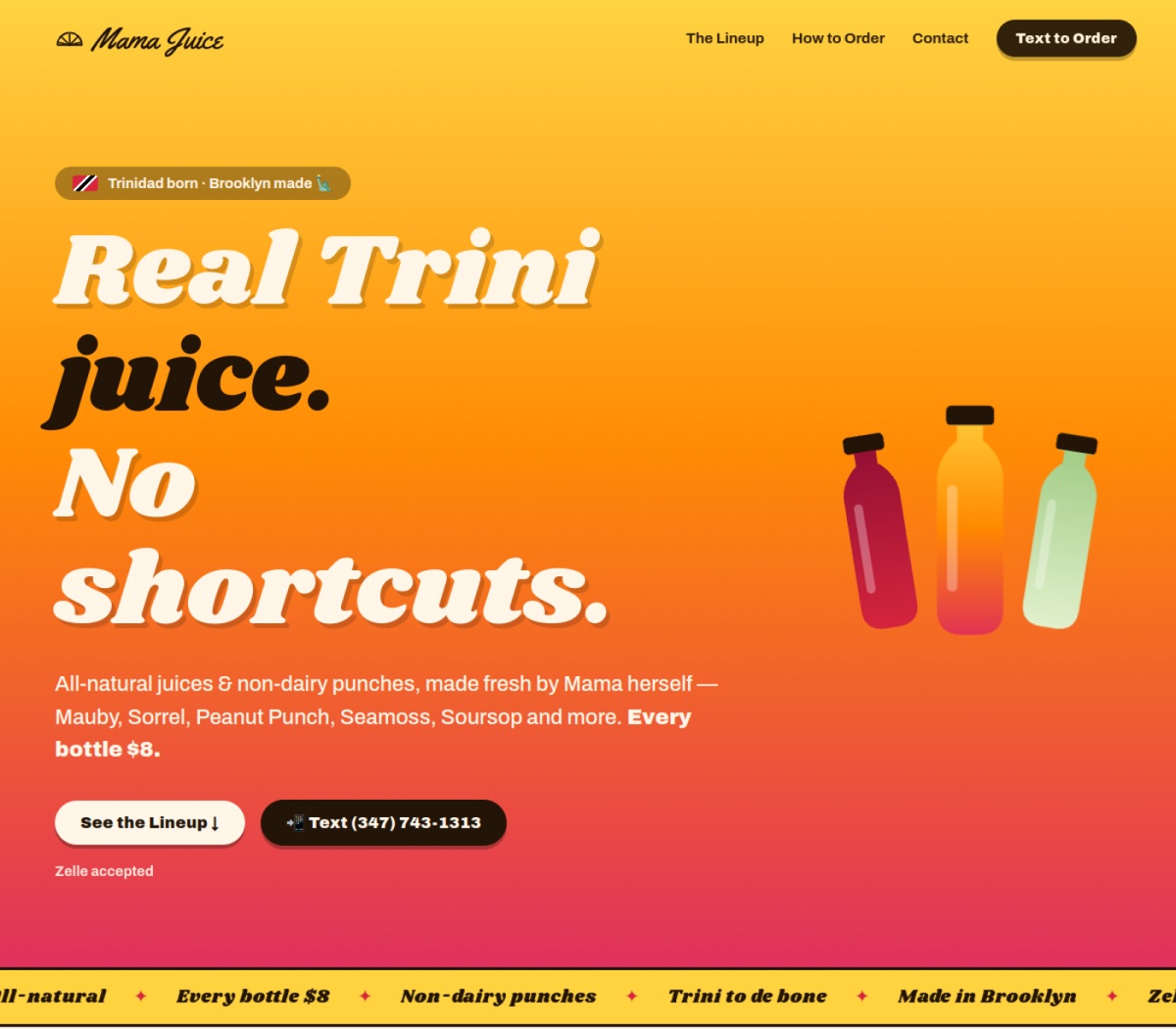
Mama Juice BK
Mama makes real Trinidadian juice in Brooklyn — all-natural, no shortcuts — and needed a proper home online to send customers from Instagram and word of mouth. The catch: it had to look craveable and make ordering effortless, without the cost and overhead of a full e-commerce store.
We built a bold, mobile-first single-page site with a Caribbean-Brooklyn personality all its own — mouthwatering type, real product up front, and a tropical palette that's nobody else's. The whole lineup gets a moment: eleven flavors, one clear $8 price. And we matched ordering to how the business actually runs — one-tap text-to-order and Zelle — instead of a cart it doesn't need.
- Responsive, mobile-first single-page site — hero, the full flavor lineup, how-to-order, and contact
- All 11 flavors (Mauby, Sorrel, Peanut Punch, Seamoss, Soursop and more) at one honest $8 price
- A frictionless text-to-order and Zelle flow, built for ordering from a phone
- A distinct brand identity plus technical SEO and Open Graph, launched live on mamajuicebk.com
Appetite is the pitch and a text is the checkout. The design makes the juice look as fresh as it is, then gets out of the way — real-brand polish that runs like a neighborhood shop.
Read the case study →Visit the live site ↗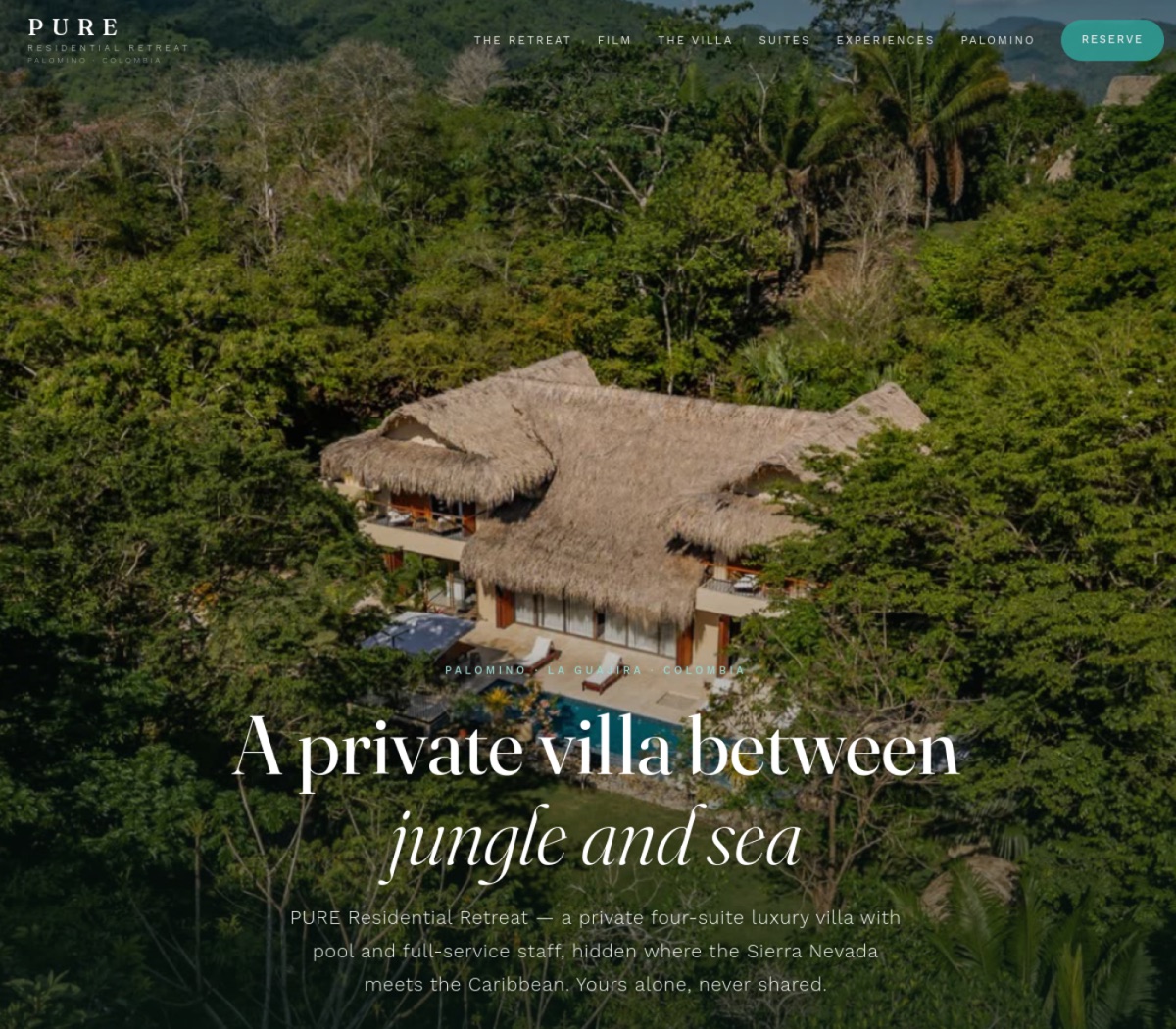
PURE Residential Retreat
The "Palomino Private Sanctuary" had sold — and its owner wanted to relaunch it as a private luxury rental, booked directly rather than lost in the noise (and fees) of the big booking platforms. It needed a site that felt like the place itself: cinematic, serene, and clearly one-of-one.
We built an enquiry-only landing site with its own coastal identity — jungle green, travertine sand, and lagoon turquoise, a world away from a listings portal. An 80-second film and drone aerials carry the feeling of the villa, and we engineered the SEO so the page ranks for real "villa rental Palomino" searches instead of leaning on a third-party platform.
- A cinematic, enquiry-only villa site — hero film, drone aerials, the suites, experiences, and Palomino
- Vacation-rental technical SEO — VacationRental and FAQ structured data, an image sitemap, and a WhatsApp-safe share card
- A direct-booking flow over WhatsApp and email — no platform commissions and no public nightly rate
- Its own coastal brand identity, distinct from Lux Haven, with fast self-hosted fonts and a launched .co domain
It sells the feeling, then removes the middleman. Guests book the villa directly — the site does the work a platform listing never could, and keeps the booking and the margin with the owner.
Read the case study →Visit the live site ↗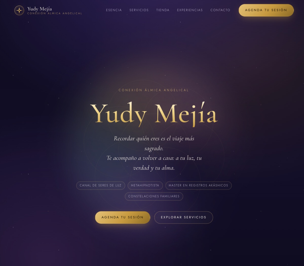
Yudy Mejía
Yudy Mejía is a Spanish-language spiritual coach and channel with a devoted Instagram following, but no home of her own online — her sessions, retreats, and remedies lived scattered across flyers and DMs. She needed one trustworthy place, as otherworldly as the work itself, that made booking effortless.
We built an immersive, Spanish-only site with a celestial identity all its own — deep indigo night, celestial gold, and a living backdrop of starfield and slowly turning sacred geometry, unlike anything else in her world or ours. Her real sessions and prices are laid out clearly, a small shop presents her remedies, and every call to action is a one-tap WhatsApp message, because that is how she actually books.
- An immersive single-page site with a bespoke celestial design — starfield, sacred geometry, and aura glows
- Her real sessions and prices — oracle & tarot, Akashic records, quantum cleansing, family constellations — laid out clearly
- A Tienda (shop) for her angelic remedies, with ordering handled directly over WhatsApp
- One-tap WhatsApp booking on every CTA with pre-filled Spanish messages, plus Instagram integration
It feels like stepping into her world. The design builds the trust a flyer can't, and WhatsApp turns intention into a booked session in a single tap.
Read the case study →Visit the live site ↗Ready to build a brand that dominates?
Book a strategy call and we'll map the highest-leverage moves for your business — then build them with you.