Amstel Agro
A Spanish-first site that meets serious growers as sophisticated buyers
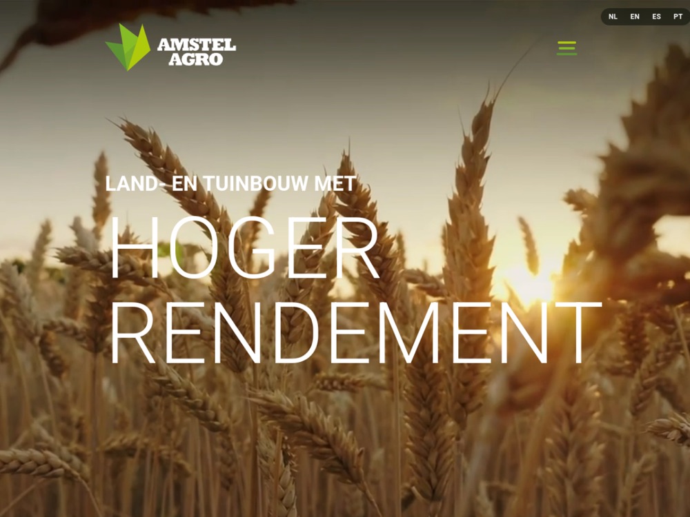
Amstel Agro is a Dutch biomineral, silicon-based fertilizer brand expanding into Spanish-speaking agricultural markets. We built a Spanish-first, photography-led marketing site that speaks to serious growers in their own language and looks as advanced as the science behind the product — a dark, editorial treatment that feels closer to a premium consumer brand than a fertilizer catalog.
The Brief
A Dutch biomineral, silicon-based fertilizer brand was moving into Spanish-speaking agricultural markets and needed a home online that could carry the weight of the science behind the product.
The problem was the category itself. Most agri-input sites are industrial, dated, and talk down to the farmer — heavy on spec sheets and logos, light on respect for the person actually making the buying decision. Amstel needed the opposite: a site written for the market, not translated into it, that read as advanced as the product it represented.
The Challenge
Two things had to be true at once. The site had to feel credibly agricultural — rooted in soil, crop, and the realities of growing — while also carrying a premium, restrained design language that most of the category never attempts.
It also had to sit within the wider Mills family without disappearing into it. Amstel needed its own identity: recognizably part of the same world, but standing on its own footing for a distinct market and a distinct buyer.
Our Approach
We designed Spanish-first. Not English content run through translation, but a site written for the market from the ground up, so the language and the framing land as native rather than adapted.
The visual direction is photography-led and editorial, with a dark treatment that gives the imagery room to carry the story. We paired Fraunces and Inter for a typographic voice that is confident without being loud, and grounded the palette in the brand greens. Imagery stays rooted in soil and crop rather than lab and logo — the field, not the factory.
What We Built
A complete Spanish-language marketing site on a premium, photography-led design system, built to feel closer to a consumer brand than an input supplier.
- A Spanish-first marketing site with a premium, photography-led design system
- Product and benefit sections that frame the silicon science as an advantage a grower can use, not a spec sheet to decode
- Distributor and contact pathways with a clear request-information call to action
- A fast, dependency-light static build, deployed live on its own hosting
Why It Works
The site treats farmers as the sophisticated buyers they are. That single decision changes everything about how it reads — the science becomes an advantage rather than jargon, and the design earns attention instead of demanding it.
Agricultural credibility meets luxury restraint. The result feels closer to a premium consumer brand than to a fertilizer catalog, and that distance is exactly what builds trust with a serious grower deciding where to put their money.
Agricultural credibility meets luxury restraint — a site that treats farmers as the sophisticated buyers they are.
Ready to turn insight into growth?
Book a strategy call and we'll map the highest-leverage moves for your brand — then build them with you.